# Bootstrap 4 Font Sizes
I wrote a small package that generates font-size classes for defined pixels for all breakpoints in Bootstrap 4.*.
It is useful for designs where the font size of a text is not linearly scaled and using REM is not helping. For example if you are using REM for spacing (.p/.m classes) and for font sizes the texts are unreadable on smaller resolutions when you scale down the base font size. By using for example font-size-20 font-size-md-16 classes you can fix this issue.
By default the SCSS generates font-size classes based on your $grid-breakpoints map. If you modify the required breakpoints for your project the change will be applied accordingly for font-size classes too.
# Installation
npm i -D bootstrap-font-sizes
yarn add -D bootstrap-font-sizes
# Options
# $max-font-size
By default the code is generating classes from 100 to 0 with font-size: 100px to font-size: 0px values for each breakpoint. It is rare case that you will need all these classes generated. To change the maximum limit of the generated font sizes you can use the variable $max-font-size. Changing the value will generate font-size classes from the specified value to 0 by default or the specified minimum by $min-font-size.
# $min-font-size
Similarly to $max-font-size you can change the lowest generated font size.
# $font-sizes
Lists of all font-size classes that will be generated for each breakpoint. This list overwrites the $max-font-size and $min-font-size options. Example:
$font-sizes: (36, 24, 20, 16, 14, 12, 10);
# Example output
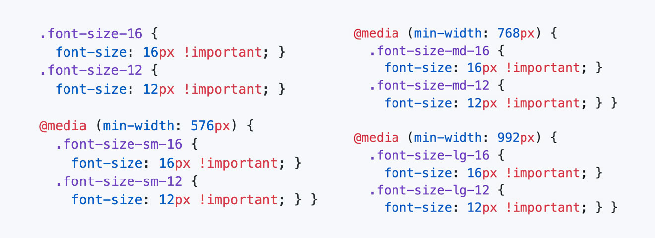
Below you can see the output for the following font sizes:
$font-sizes: (16, 12);
@import "node_modules/bootstrap-font-sizes/font-sizes";
Output
.font-size-16 {
  font-size: 16px !important; }
.font-size-12 {
  font-size: 12px !important; }

@media (min-width: 576px) {
  .font-size-sm-16 {
    font-size: 16px !important; }
  .font-size-sm-12 {
    font-size: 12px !important; } }

@media (min-width: 768px) {
  .font-size-md-16 {
    font-size: 16px !important; }
  .font-size-md-12 {
    font-size: 12px !important; } }

@media (min-width: 992px) {
  .font-size-lg-16 {
    font-size: 16px !important; }
  .font-size-lg-12 {
    font-size: 12px !important; } }

@media (min-width: 1200px) {
  .font-size-xl-16 {
    font-size: 16px !important; }
  .font-size-xl-12 {
    font-size: 12px !important; } }